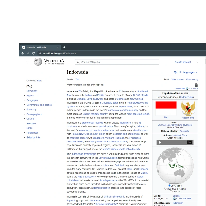
Wikipedia, one of the world’s top most visited websites, is having a change in appearance.
The online encyclopedia has long been the source for information by billions of people every month. And this time, the Wikimedia Foundation, which runs the Wikipedia project, announced the launch of an updated interface aimed at making the site more accessible and easier to use.
What it does here, is improving search, make the language switcher more prominent, updated header to offer easier access to commonly used links, updated the table of content section, and other slight improvements for a better reading experience.
This marks the first time Wikipedia is redesigning its website interface after more than a decade.
Regardless, while the changes may not be that dramatic, and that some may not even be immediately noticed by some users, the redesign certainly packs a punch.
It is a big day for Wikipedia: We are getting a new look!
For the first time in 10+ years, and during our 22nd birthday month, a series of updates to English Wikipedia’s desktop will make the site more welcoming and easier to use for everyone!
Explore the changes (1/9) pic.twitter.com/TRwaMqviWe— Wikipedia (@Wikipedia) January 18, 2023
The organization said that the update was necessary, in order to appeal new and younger generation of internet users.
For those people who are already into social media, the appearance of the old Wikipedia may look boring. So here, the change is especially tailored for those who are more newly coming online and may have less familiarity with the web.
The goal for the update, is to make Wikipedia look more modern.
By removing some unnecessary web design elements, the website is less cluttered. Not only that, the redesign also makes it easier for people to contribute to the online encyclopedia.
And more importantly, the redesign makes Wikipedia on desktop a lot similar to Wikipedia on mobile.
To develop the redesigned interface, the Wikimedia Foundation worked with more than 30 different volunteer groups from around the world, with users in countries like India, Indonesia, Ghana and Argentina, among others.
The makeover, which is also known as “Vector 2022," which is a reference to the name of the default Wikipedia skin, had been in the works for three years.
Table of contents
The new table of contents helps you know which section you are currently reading and get helpful context. It remains visible as you scroll down the page, making it easier to navigate to various sections. (2/9) pic.twitter.com/SH168uDcmA— Wikipedia (@Wikipedia) January 18, 2023
Among the changes is a redesigned table of contents section on the left side of articles, which helps people navigate through longer content.
The redesign makes that section prominently visible, even when users scroll down the page. This should help users see which section they’re currently reading, thus allowing them to jump to different section on the page in a much easier manner.
Language-switching tools
More prominently-placed language-switching tools that allow multilingual readers and editors to more quickly find their preferred language and switch between over 300 languages. (3/9) pic.twitter.com/9ZJR543xpM— Wikipedia (@Wikipedia) January 18, 2023
Then, Wikipedia also tweaks its language-switching tool.
This time, it's bumped up to a much more prominent position at the top right. This in turn should allow readers and editors to easily switch between over 300 supported languages.
Another change involves an updated sticky header. Here, Wikipedia is pinning its most commonly used links, like Search, the Page name and Sections.
What this means, users are no longer required to scroll back up to the top to find what they're looking for, allowing users to stay focused on reading or editing the content instead.
Line width and font size
Wikipedia articles will now have a maximum line width, which supports a more comfortable reading experience and better retention of the content. The default font-size has also been increased to make reading long paragraphs more comfortable. (4/9) pic.twitter.com/8C9sSak2We— Wikipedia (@Wikipedia) January 18, 2023
After that, Wikipedia's redesign also increased the default font size for better reading comfort.
Search experience
An improved search experience, which now leverages images and descriptions, makes it easier to find articles on Wikipedia, leading to a 30 percent increase in user searches based on testing. (5/9) pic.twitter.com/baSteGDxBO— Wikipedia (@Wikipedia) January 18, 2023
Then, there is an improved search box that supports both images and descriptions in its autocomplete suggestions.
Collapsible sidebar
A new collapsible sidebar allows you to collapse the lengthy menu found on the left side of each article, helping you see the information you need without distraction. (6/9) pic.twitter.com/lTSOduU0g9— Wikipedia (@Wikipedia) January 18, 2023
Wikipedia also made some change to the maximum line width.
The foundation explained that limiting the width of long-form text can create a more comfortable reading experience and improves retention. However, since computer screens have become wider and wider, Wikipedia is providing a toggle for users, if users use a monitor screen that is 1,600 pixels or wider. Toggling allows users to increase the width of the page.
Users who are logged in can also set a width in their preferences page.
Updated header
When you are logged in to Wikipedia, the updated header will move with you as you scroll. You will no longer need to scroll to the top of the page to find what you are looking for, and you can focus on reading and editing instead. (7/9) pic.twitter.com/CPXT4eihbL— Wikipedia (@Wikipedia) January 18, 2023
The new features, which start rolling out on English Wikipedia today, were built in collaboration with Wikipedia volunteers worldwide.
Learn more about the new look, and share your feedback. (8/9)https://t.co/xPQC6INFdc— Wikipedia (@Wikipedia) January 18, 2023
P.S. It may take some time for the new changes to deploy fully and be visible across all of English Wikipedia. If you want to see what the updated desktop looks like now, try this link: https://t.co/k4g5t072ma (9/9)
— Wikipedia (@Wikipedia) January 18, 2023
It's worth noting that the design has been launched on hundreds of language versions of Wikipedia, before finally arriving to the English Wikipedia.
Given the size of Wikipedia, the organization is launching the redesign slowly but steadily. This, in order to prevent any disruption or alienating users, all in a sudden.
The organization is also making things clear, that no existing functionality is removed as a part of these changes. Instead, everything focuses on usability improvements and modernizing the site.
This changes are subtle, but in all, the features simply blend in together to a create a much more modern experience.
From the visual cues to the pinning of most-used links, to autocomplete search box and all, should make Wikipedia a lot more helpful.
The Wikimedia Foundation said this update led to a 30% increase in user searches when it was tested.