
When the internet was still young and there was little information available, we hungered for more and more. But when the internet matures and information is more than plenty, we want less.
"Less" information here means simplicity.
With the amount of information people can consume on the web, including from your website, don't make people overwhelmed with unnecessary things because clutter will put your visitors' brain into a state of confusion, driving less engagement and conversion.
In the time where people's attention has decreased, you need to put what's best in you forward, and what's not important much further back.
Moving away from complexity and sophistication, from a user perspective, will make websites easier to navigate and have more enjoyable experience.
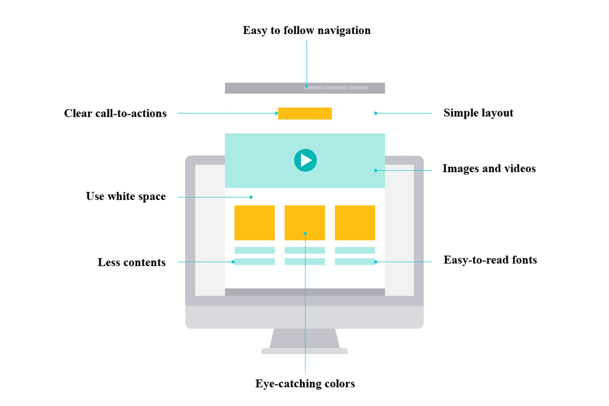
Below are eight web design rules you can follow, so your website can be both appealing and engaging:
Keep It Simple
The simpler your website's design, the better. Less and simple aren't meant to be boring, but here they focused on only the essentials.
This is where clean and functional layouts are to make your website easier to load, navigate, and use on different platforms and devices.
Easy To Follow Navigation
In order to ease people in browsing your entire website, you need to make navigation easy to follow.
Navigation menus with simple design allows users to understand what pages they will see when engaging with them. Making your menus standard in appearance can ensure that your readers feel comfortable when they land on your site.
Clear Call-To-Actions
What is the intention of your pages? Sign ups? Subscribers to newsletters? Clicks on ads? Donations? Buy products or services?
Use call-to-action buttons to help you with these. But make sure that they stand out in a way that they are distinguishable from the rest of your website's design elements. Also make sure that the text inside the the button is short and direct.
Less To Make More
Options are good. But too many will create confusion. Know what your visitors are expecting you to deliver, minimize the distraction, and focus their attention to your content, products and ads.
Show only the text and visual elements that need to be there, and nothing more.
Use White Space
White space creates peace. It's a break to what visitors are doing, giving them a moment to pause.
White spaces don't need to be "white". They just need to contain no text or images. White spaces are those blank spaces that has the same color as the background color. If done well, it can enhance your website design and improve readability.
White space can also help direct focus and attention.
Eye-Catching Colors
Colors play with emotions. A color palate you chose, should highlight your brand, providing the foundation of your entire website design.
Contrasting colors can differentiate different website elements, highlighting different interface as well as important buttons.
Attractive And Easy-To-Read Fonts
Opting for simplicity means that fonts should also be a concern. An attractive font can be appealing, but when you compete for attention, there should be a balance between attractiveness and clarity.
So if you’re creating contents with the main goal to be printed on paper, then sans-serif for titles and headers, serif for the physique of the textual content can be your best choice. However, in case you‘re creating contents for the web and primarily be viewed on the computer, sticking with a sans-serif font for everything is more ideal.
Use Video and Rich Images
Images can speak a thousand words, and videos can speak a thousand images. What this means, both images and videos are more engaging than text content alone.
Choices of images and videos should align with your text content, to ensure that your content can deliver the message well. A good combination between text, images and videos, will elevate user-experience.