
For a website to thrive, it needs visitors.
While many webmasters spend their efforts in getting more and more visitors, lesser number of them are trying to lower their bounce rate.
While it can be either easy or hard to get more visitors, it's definitely easier to get a visitor already on your site to go on other pages. The reason is because the hardest part has past, and all you need is to persuade them to venture more.
To do this, you need to leverage brand recognition and trust, leading to conversation down the line. This is how the science work: user-experience, and there are 7 distinct keys:
- Useful: Making your contents help visitors.
- Useable: Contents should be practical, and tools must work as designed.
- Desirable: Giving what people want from you.
- Findable: Can be reached, indexed, browsed and so forth.
- Accessible: Your contents should be accessible without giving poor experience.
- Credible: You need to be trusted, before giving great experiences to visitors.
- Valuable: Your website needs to accomplish something that people find valuable/useful.
Create Links For Users
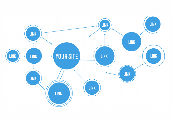
More than often, website owners create backlinks in order to get the most out of their SEO strategy. This is a mistake since search engines' decision to give a high rank to a website also depends on how the site is perceived by its visitors.
So if a site has a high bounce rate, search engines will consider the site as having a bad user experience. This is why backlinks only won't help your website to rank well on search engines' results pages.
Here, you need to create backlinks to your pages, and also internal links on your site that promote related content or old posts. Instead of putting as many links as you can on articles, it would be wiser if you can just link some keywords to give answers to any incoming questions your visitors may have.
Besides answering questions, links should also:
- Encourage exploring: Connecting the reader to another article, giving them the chance to continue reading.
- Build trust: Links should make your post more credible.
It should be noted that links you have on your site can be valuable if visitors are already familiar with your work. So if you can create a highly relevant posts, a link at a right place should be enough to make visitors stay.
Speed
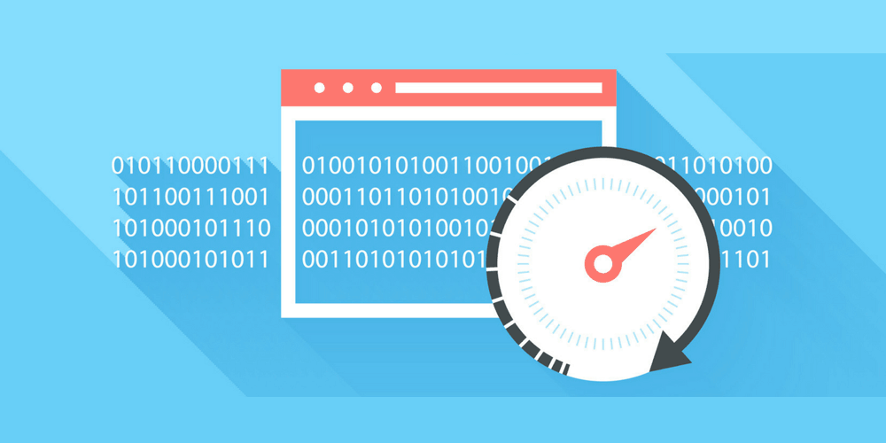
On the web, speed matters. And when it matters, it matters very much.
Slow loading pages aren't just annoying, as they will turn visitors away from your contents. Most internet users are expecting web pages to load in seconds. After 2-4 seconds on desktop or 6 seconds on mobile, that visitor will flee with hopes to never return.
As a website owner, you should constantly check how your website is performing on your targeted audiences' devices. Does it render well? How fast is it on desktop and mobile? Is it throttled on certain countries? There are many questions that need answering.
There are a lot of ways for you to optimize the speed of your website, and here they fall into the following categories:
- Size: Measured in bytes, ideally, your site should not be larger than a few hundred of kilobytes to at least 1 or more megabytes for image-heavy pages. The smaller the size, the better.
- HTTP request: This is the number of request a page needs, within HTML. Each request takes time to process, so it's better to reduce the number as low as possible.
- Hosting and delivery: From the location of your server, CDN, caching ability and others. They affect how good and how fast your web pages load.
To extract the most information out of your website, you may want to analyze your website's waterfall diagram to know where to improve.
Eliminating Distractions
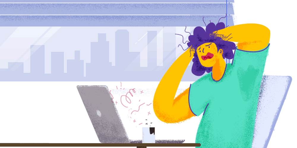
Your message needs to clear, front, concise and center. No matter where your visitors land on your website, that message should be there.
Your pages should make contents easily accessible. This way, visitors will continue reading. If you make things difficult for them, many will either leave right away or not be excited to visit another page on your site.
To tackle this problem, there are 3 common sources of distractions that should be taken care of:
- Minimize or eliminate the sidebar: Sidebar can create distraction. Use sidebar only when needed, and make sure it isn't flashy.
- Eliminating some scroll elements: From banners to navigation menu. Should they follow anywhere visitors are scrolling?
- Delay or eliminate popups: Nobody likes it. Even if people are liking it, they want to get rid of it. Try to never annoy visitors.
Consistency
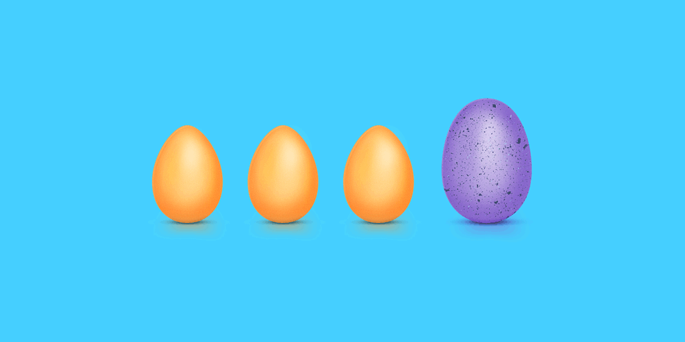
For visitors to stay longer on your site, you need to be credible. And one of the best ways to be credible, is to first be consistent.
First of all, you may have designed your site to show certain characteristics of your business. The most important aspect here, is to keep that character, and make it consistent to whatever landing page you have. Second, is to make sure that your branding, icons and symbols, as well as your site's logo, are clearly defined.
For example: if your website's logo is located at the top corner of your page, you should make sure that its position won't change on any other pages. If your navigation menu uses a 'hamburger icon', make sure that it is visible and distinguishable. And if your product is associated with a symbol or image, you should use that same visual and terms across all forms of communication.
Another thing you should consider, is consistency on your site's hierarchy. This is for your returning visitors to know what to expect. So if they want to find blog posts, they should know how to do it. If they want to hire you, same thing: getting in touch with you should be easy.
This way, you can ensure that visitors will see what they're expecting.
Important Things Must Be Clearly Visible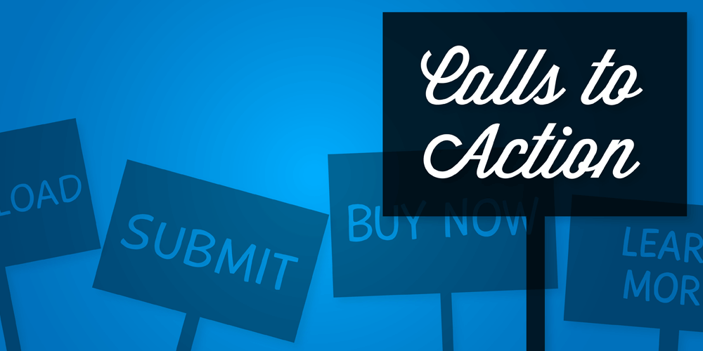
What is it that you want your visitors to do? Subscribe to your newsletter? Register to your website? Download something? Buy something? Or just click on ads?
First thing first.
In order for your site to be successful, you need to put what's important forefront so people can identify your purpose easier. Here, visibility is the key. It can either be big, distinguishable, or just plain visible.
And in terms of lowering bounce rate, consider making links more visible and easy to click. For example, if your website is dominantly white, your may choose the color blue for links (blue is the default color for links). But if your site is mostly blue, you may try to use other colors to make those links stand out.
Remember that you can also make your site's design elements more visible by emphasizing them. For example you can separate one element from another using white space.
The goal here, is to highlight the most important part of your page. Tests are required to know which strategy converts best.
What do you want your users do? Know that and highlight that. Make it distinguishable and clearly visible. This is the key part of usability.