
How is your logo? Does it highlight what you are up to? Do people like it? How are the shapes and fonts add up to your branding?
A logo is a graphic mark, emblem, or symbol used for public recognition. There are several types of logo design. No matter what type your logo is, it should be at the forefront of whatever you're doing; capable in distinguishing itself from the crowd, promoting itself to the masses.
Mistakes in a logo design will ruin your brand image. Even if it's not intentional, you can become a laughing stock, making you a victim of public distrust.
The way a logo design is emphasized, should represent the fundamental steps in your branding process.
Logo empowers visual identity with its ability to communicate your business strategy.
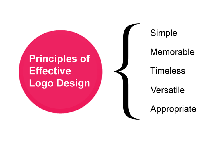
So here, logo design is not an easy task. Designing a logo that aligns with your brand can be daunting and most of the time, overlooked. Below is a list of mistakes you or any logo designers can technically do when designing a logo.
Design Without Planning
Creating a good logo involves careful planning.
This includes doing researches about what you are doing and who are your audience. Market research is also key, as it is with understanding about your visions and missions.
Not Using The Appropriate Format
The format of your logo largely depends on your requirements and needs. You should always align your logo with the right format.
Neglecting The Trends
Things change. Something that is today a hype, may not be anymore interesting tomorrow.
This is why you should research the trends and see what matches you needs. While it can be great to implement the current design trends to your logo, but if things change too quickly, your very 'modern' logo would become outdated very soon.
Redesigning a logo is not a process that should frequently happen. A logo represents your brand, and even a small change can have a domino effect to your overall presence, reception and brand credibility. So here, you need to do your research well.
Putting Creativity Aside
Creativity is the most important aspect of a great and aspiring logo.
The worst thing you can do, is copy someone else's work, and blatantly passing it off as your own. This won't only disgrace your business, but also yourself. It's a burden, and should not even happen in the first place if you appreciate people's work.
Not Using The Right Fonts
Font spells the words out loud. It's something that people will read and what people will memorize.
A logo should not have more than two types of fonts. The more fonts being used, will create clutter and put the overall design into chaos. It will also affect readability and how well people can memorize your brand's name.
If your logo is a wordmark type, you need to pay even more attention to the font being used. You need to alter, recreate or even create a new one just to make your logo a good one.
Not Using The Right Images
Image speaks a thousand words. Iconic/symbolic logo should pay close attention to this because shapes and colors really matter for this type of logo.
Always use or create high-quality vector images for your logo, and avoid raster images and low-quality images. This will make sure that your logo is scalable to any size without any loss of quality and sharpness.
Using Designs That Are Too Complex
Less means more. Not that your logo should be flat, plain and too simple. It's just that your logo should only use the elements of design needed, and nothing more.
You should never stuff your logo with unnecessary details. This will add complexity, making your logo harder in conveying its message.
One simple way to create a logo that is simple but effective professionally, is by using the golden ratio. This will help you prevent unnecessary shapes and sizes.
Not Infusing Brand Or Business
It's important for your logo to be able to convey its message properly, able to speak of your brand and business it represents.
Launching Without Proof-Reading
You have the final draft of your logo. That's good. But before launching it to the public, do take a close and thorough look at it.
How does the shapes and colors look? The fonts, are they readable? Looking from afar, how does it look? Are the shapes have different/double meaning?