
![]() Twitter, the 140-character microblogging site, launched a new and very Facebook-like design for profile pages. Initially rolled out to a limited number of users, but on April 22nd, 2014, Twitter has announced that it's now available for all users using its web version.
Twitter, the 140-character microblogging site, launched a new and very Facebook-like design for profile pages. Initially rolled out to a limited number of users, but on April 22nd, 2014, Twitter has announced that it's now available for all users using its web version.
The design includes a lot of new features, but Twitter is letting users try them out before they apply the change themselves. If the user finds that they like the new look, they can switch it on. If not, they can leave their profile as it already is since the new design is still rolling out. Eventually, Twitter will make users change to the new version at a later date.
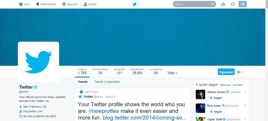
The new design was first debuted earlier in April 2014, featuring a photo-centric layout reminiscent of Facebook and Google+. The first detailed announcement was made by the designer, David Bellona, saying that the new web profiles features a larger profile photo, a header (cover) photo, and the ability to pin favorite tweets to the top of the user's profile.
The new highlighted features about the web profile include:
- Best Tweets. A slightly larger tweets that have received more engagement.
- Pinned Tweet. Tweet can be pinned to the top of the page.
- Filtered Tweets: Users can select which timeline to view (Tweets, Tweets with photos/videos, or Tweets and replies).
According to Bellona, the pinning feature lets followers see "what you're all about." It also creates a significantly better profile experience for brands, allowing them to promote themselves more effectively.
Tweets that do more engagements use a font that is much larger than others, contrasting themselves against the fonts that are on the left and right columns which still use a smaller font. Twitter wants that central column to 'pop' and become the first thing users see when they first see their profile.
Since Twitter introduced the option to include inline photos and videos, these were cramped into a box on the left-hand column. In the new design, picture/video is just another menu option next to tweets and followers. When clicked, it enlarges itself occupying both the center and right-hand column, giving users a full two-column view. The old design also included both tweets and replies in one unbroken stream under "tweets." The new design defaults to just your tweets (without replies) and lets the user to opt to view "tweets and replies," as well as favorites and followers (now appear like photos/videos, in a semi-tiled view in a two-column space).
The new design may not appeal well to everyone since it alters the look and feel of Twitter's website that users are already got used to. But despite the more complicated design, Twitter is still keeping its features as simple as possible, far from Facebook's busy layout. Twitter's profile pages now use browser-space more efficiently, fitting more in without cramping the view.
The design is another effort from Twitter to make itself an increasingly media-centric social network. With the new design, Twitter is making itself similar to Facebook and Google+. All of these three social network feature cover photos, overlapping profile photos, all presented in a three-column layout.