
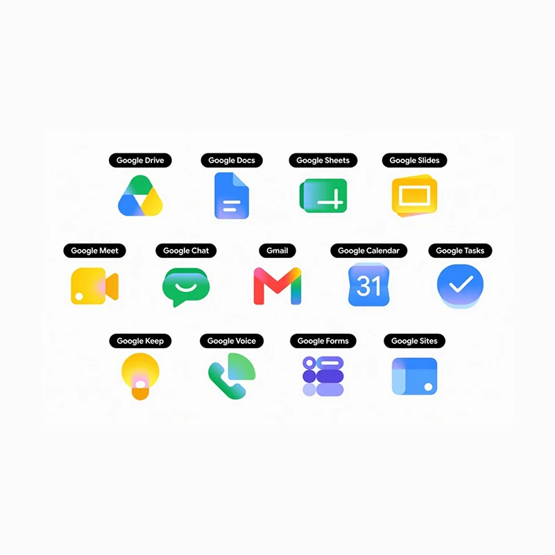
Google has refreshed the icons for its Workspace suite of apps, including Gmail, Drive, Calendar, Docs, Sheets, Slides, Meet, Chat, and several others.
The icon now has a new visual style built around smooth gradients and softer, rounded shapes. The update draws directly from the colorful gradient treatment already seen in the company's "G" logo, as well as the Gemini, Photos, and Maps icons, signaling a broader shift in Google's design language toward a more fluid, modern aesthetic that reflects the increasing role of artificial intelligence across its products.
The previous icons relied on flat colors and sharp edges, often incorporating all four of Google's signature colors: blue, red, yellow, and green, within a uniform container or page-like frame. That approach had drawn occasional criticism for making the apps feel too similar at a glance.
The new designs move away from that rigidity.
First reported by 9to5Google, many icons now feature a single dominant color paired with subtle gradient transitions, larger and bolder elements, and rounded contours that give them a more distinctive presence on home screens and app drawers.
But color is not only the redesign. This is because the change also incorporates the shape of the logos themselves.
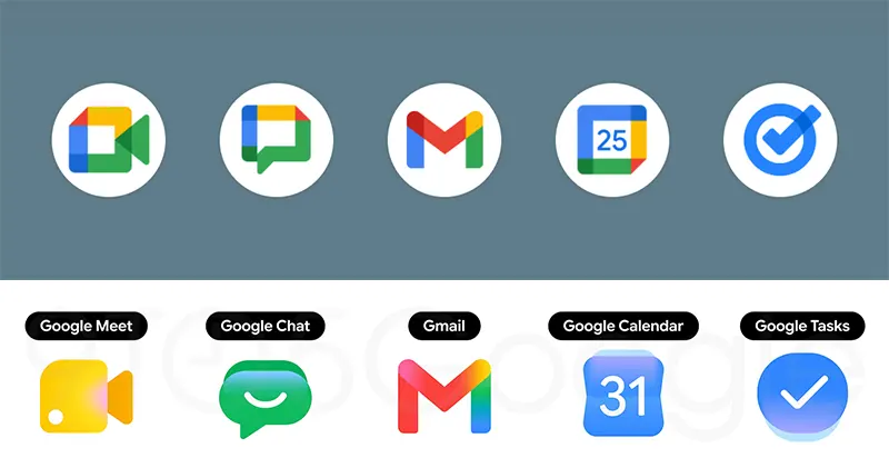
Among the most noticeable changes is Gmail's envelope, which keeps its familiar "M" shape but rounds the edges slightly and shifts to a predominantly red palette with faint traces of the other colors for continuity.
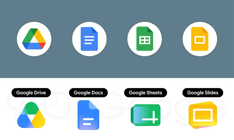
Drive's triangular logo has been softened with rounded corners and a gradient blend of green, yellow, and blue that echoes the editor apps.
Calendar returns to a skeuomorphic style reminiscent of older flip-clock displays, rendered in classic blue without the multicolored box that once framed the date.
Meet's video camera icon has traded its sharp, multicolored frame for a rounded yellow design, while Chat has been transformed into a friendly green speech-bubble shape with a gentle smile curve, nodding back to the earlier Hangouts aesthetic.
Docs, Sheets, and Slides retain their core paper motifs but now appear in landscape orientation for Sheets and Slides, with simplified line details and single-color emphasis.
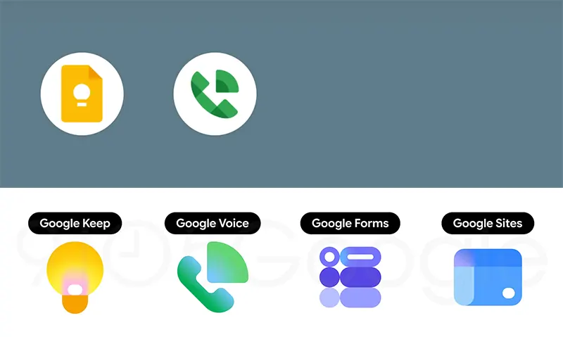
Tasks simplifies its checkmark into a clean blue gradient disc, Keep enlarges its light-bulb icon without the old folded-paper background, and Forms replaces its paper motif with purple multiple-choice bubbles.
Voice and Sites have also received subtler refinements, with rounded forms and lighter or more focused color schemes.
Across the board, the page-container element that once unified the icons has been removed, allowing each app to stand on its own visual identity while still feeling part of a cohesive family.
The redesign is the latest step in a design evolution that began in 2025 with the brighter gradient "G" logo and continued through updates to Photos and Maps earlier this year.
As of late April 2026, the new Workspace icons have not yet appeared on user devices, though reports indicate that at least five have been finalized and the full set is expected to roll out gradually. No official rollout timeline has been shared, and the changes appear to stem from internal design work aimed at better aligning the apps’ appearance with their growing AI capabilities, particularly those powered by Gemini.
Observers have noted that the shift prioritizes clarity and modernity over the earlier emphasis on strict color consistency.
The refreshed icons represent another incremental step in Google’s effort to give its productivity tools a unified yet distinctive visual identity that keeps pace with the company's broader technological direction.