

Facebook is up for a redesign. It's a minor one, but it could certainly change the look and feel, as well as the experience in using the social network.
First of all, Facebook has updated a number of core features. With the design tweaks rolling out slowly to all users, the most noticeable change is the profile picture of users. Facebook has decided to make them to appear circular, not like the previous square design.
The circle profile pictures of users appear in the News Feed.
Another update is Facebook in tweaking the iconic Like button. Instead of the previous solid-gray look, the new Like is mostly white with a gray outline.
The gray outline will change to blue once users "like" something. Not just changing the icon, the social network has also made it larger and easier to tap.
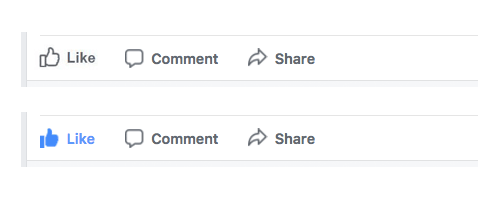
Facebook has also given both the Comment and Share icon a similar treatment as well.
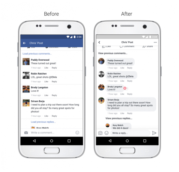
And as for the Comment threads, Facebook made them to appear inside grey bubbles so it's "easier to see which comments are direct replies to another person".
Facebook also said that it's making the link previews larger. The "increased color contrast so that typography is more legible", and made it easier to return to the News Feed after users have clicked on a post.
The social network actually introduced the redesign a couple weeks back when it introduced its very-gray, News Feed. The new look is gradually making its way to both desktop and mobile.
While the design shift isn't at all big, but it's indeed noticeable. As with people in social media, the nature is any changes will have a mixed reactions. This can be seen when Twitter made a similar move back in June. Users were reacting with anger.
Shali Nguyen, Facebook’s product design manager and Ryan Freitas, the site’s design director, said that:
"And with so many types of stories available, each feed is more complex than ever. In order to make News Feed more conversational and easier to read and navigate, we’ll be making a few updates to its design over the coming weeks."