
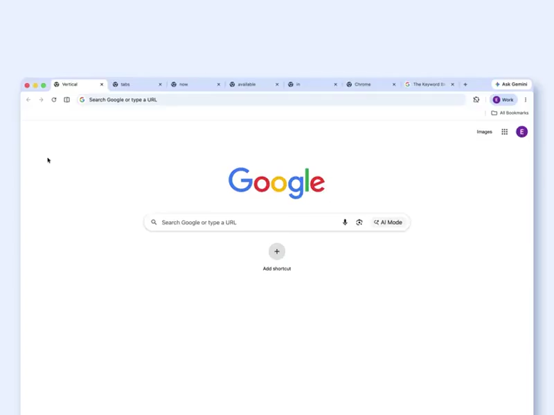
Google Chrome has long been the default browser for billions of users, but one persistent request from power users and productivity enthusiasts has finally been answered.
And that is with the arrival of vertical tabs. With this update, Chrome literally flips Chrome's traditional top-row tab layout on its side, moving open tabs into a clean sidebar that runs vertically along the left edge of the window. No more squinting at truncated titles or endlessly scrolling through a crowded horizontal bar when dozens of tabs are open; instead.
With this vertical tabs support, users get a full-height view where each tab displays its complete name and favicon at a glance, making it far easier to scan, organize, and switch between them.
The feature integrates seamlessly with Chrome's existing tab groups, so color-coded clusters stay intact and collapsible, turning chaotic multitasking into something that feels almost spatial and intuitive.
Users simply right-click on any tab or the tab bar itself and select "Show Tabs Vertically" to activate it, with the option to toggle back to the classic horizontal setup anytime.
T
A
B
S
I
N
C
H
R
O
M
E https://t.co/Y7fPAlF4Cw— Sundar Pichai (@sundarpichai) April 7, 2026
Alongside this tab transformation, according to Google in a blog post, Chrome is rolling out an enhanced immersive reading mode that delivers a full-page, distraction-free experience.
Right-clicking on a webpage now offers "Open in reading mode," which strips away ads, sidebars, videos, and other clutter, presenting just the core text and essential links in a clean, customizable layout. It's a step up from Chrome’s previous side-panel reading view, giving readers an entire browser window dedicated to focus without losing the ability to quickly exit back to the full site.
Both features are rolling out gradually across all platforms and markets, building on months of testing in Chrome’s Canary and Beta channels that began in late 2025.
For anyone who juggles research, work tabs, or long-form articles, the combination feels like a genuine productivity boost, freeing up screen real estate and reducing the mental load of browser overload.
Learn more: https://t.co/0P9k1r3OZX
— Chrome (@googlechrome) April 7, 2026
Chrome’s vertical tabs arrive surprisingly late, especially considering that Microsoft Edge brought a polished version to the mainstream around 2020 with collapsible sidebars and smart tab management, while Vivaldi had already pushed the concept further with deep customization, tab stacking, and flexible layouts.
The real modern shift, though, came from Arc Browser, which turned vertical tabs into a core philosophy, pairing them with workspaces, auto-archiving, and a streamlined sidebar that reimagined how people organize browsing.
By comparison, Chrome's implementation is more middle-ground: accessible and clean, but lacking the advanced features or bold redesigns seen elsewhere.
It doesn't yet match Edge's polish, Vivaldi's flexibility, or Arc's innovation, but it closes a long-standing gap for Chrome’s massive user base and reinforces that vertical tabs are now a standard, not a niche.
The same pattern applies to its reading mode, which follows ideas popularized by Safari's Reader View and Edge’s Immersive Reader: useful, but not groundbreaking.
Taken together, these updates show Chrome evolving by adopting proven ideas rather than leading them, making the browser feel more modern while preserving its familiar experience.