

Material Design is Google's design language, meant to be the principle for designs for Google products and beyond.
After giving Gmail a significant design update, it's Google Drive's turn to get a look to match. But the difference is that Google Drive has used the company’s Material Design aesthetic for quite some time, so the change isn’t quite as dramatic as Gmail’s
But still, the changes are clearly visible.
In the company's G Suite blog, Google details the changes:
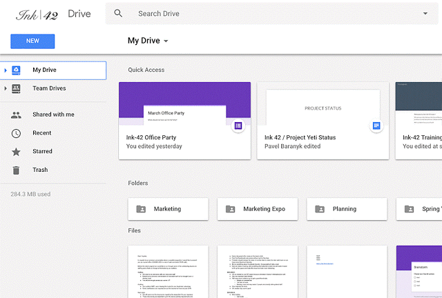
- The logo in the top left has been changed to the Google Drive logo.
- If Users have added a custom company logo, it is shown in the top right.
- The Settings icon has been moved in line with the search bar.
- The Help Center icon has been moved in line with the search bar.
- The page background has been changed to white (previously gray).
- The "New" button has been updated.
- The font used for headers has been changed.
"We’re making some updates to the look and feel of Google Drive on the web," said Google on its blog post.
"There’s no change in functionality, but some icons and buttons have moved, and there’s a range of visual tweaks to align with Google’s latest material design principles. We built this new interface to create a responsive and efficient experience for Drive users, and to feel cohesive with other G Suite products."
The changes in Drive's design is rolling out to all end users.