Polling numbers, sales figures, movie ratings, etc., they are data visualizations that are usually used in storytelling tool of journalism.
But data visualizations represented by numbers can be boring to see.
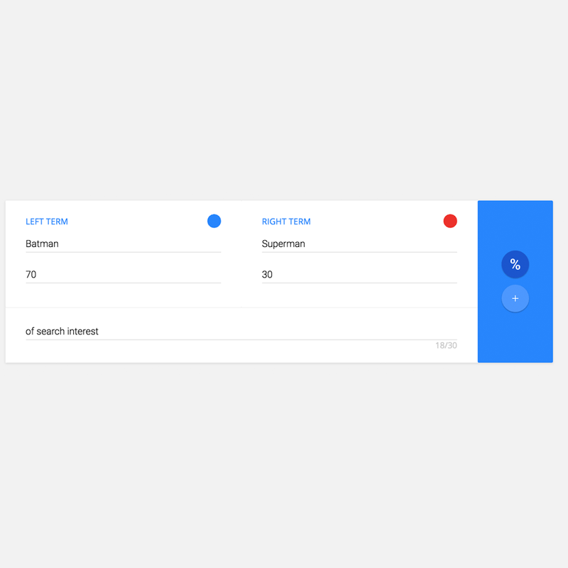
Google wants users to show some interest by launching an animation tool to make them more appealing. In Google's Trend Explore tool, the company has launched a 'Data Gif Maker' tool where users can turn two numbers into some interesting GIF illustration animations.
According to Google data editor Simon Rogers, the company built the little app to make thing easier for journalists to rely on data while telling stories. But anyone can simply benefit from the tool.
To use the Data Gif Maker. users need to:
- Enter data points.
- Choose names for the points of comparison.
- Select the colors for each data entry.
- Add some explanatory text.
Users can then click the "Download as GIF' to generate the animation images.

While visualizing data using Data Gif Maker can certainly make boring numbers a lot more interesting, Google overlooked its ability to change displayed data over time. So if for example the GIF animation is about a poll, the two numbers within the poll will still be the same until the end because the animation is just a single file. Here, users need to at least add additional information separately.
What's more, it takes the tool quite a considerable amount of time to generate the file to download.
But still, the feature can give a bit of joy and colors to the plain old numbers.