
People can get bored, and things may not be trend now, as they were years before. This is why a change is a must.
YouTube is the largest online-streaming platform the internet has ever seen. Owned by Google, the platform sees billions of users watching its endless videos streams, as their eyes are glued to their screen.
To please those eyes, YouTube introduces a subtle change to how its icons look.
Previously, YouTube introduced an updated set of icons, which have an outline-style design, to its users on both Android and iOS.
The design makes use of users' smaller screens, by emphasizing the same information, but by leveraging more white space. This makes the looks cleaner, but still appealing.
This time, YouTube completes the roll out, by also introducing the outline-style icon design, to its web interface.
With the change, users can finally experience the same icon design across different platforms.
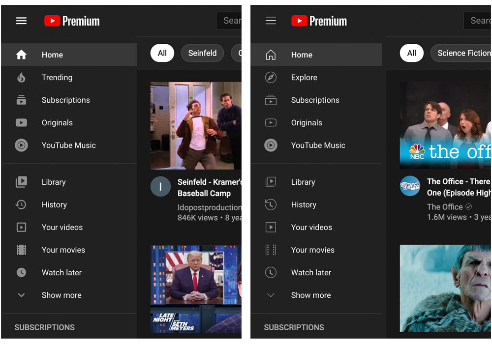
On YouTube for the web, users can access various parts of the platform using the navigation drawer on the left-hand side of the screen.
And this icon redesign applies to Home, Explore, Subscriptions, Originals, Library, and more, but not YouTube Music, because it's a logo and not an icon.
While the redesigned icons do create a better white space experience, which makes viewing less cluttered, the outline-styled icons however, aren't never filled in, even when they are active.
Active icons are only slightly brighter when compared to non-selected icons.
What this means, the redesigned icons can hamper visibility. This happens because the icons are less likely to stand out on a busy page, which can either be a bad thing or a good thing, depending of the design objective.
But if putting that aside, the icons, alongside the custom font, are the signs that YouTube is trying to differentiate itself from other Google apps, which are mostly using Material Design design language.
After all, YouTube is a different company.
The streaming giant is Google's, but has its own CEO, led by Susan Wojcicki. What this means, YouTube is ran as a separate company.
It should be noted that the redesigned icon for the YouTube web experience is rolling out gradually, and not simultaneously for all users in all countries.
