
No website on the internet is 100 percent perfect. With flaws here and there, website owners need to conceal them to preserve great experience and security.
But how about the things than can't be hidden? From slow loading website, broken links, non-responsive pages or poor design? Yes, they are all turn offs. These flaws can make visitors visiting your website to never again return. This is the main reason why you should always put user experience as a priority in your business' development strategy.
After all, what is a website that can't convert?
To prevent such things from happening, below is a list of common user experience mistakes that can repel visitors:
Not Designing For Mobile
As more people have access to the internet via mobile, it's best for your website to be mobile-first.
Websites that don't show properly on smartphones and tablets, are losing an increasing number of visitors.
One best and easy way to do this, is by using responsive web design that have mobile users as priority.
Too Much Content
How long is too long? Your post shouldn't be too short because it'll affect your credibility. But if your post is too long, you'll risk making people bored.
Try to make your contents as short as possible, but without leaving professionalism, great writing and marketing messages behind. But don't put too much gimmicks on the page, or too much media that people will have to scroll many many times to get to the end of the page.
Unless your page is designed to be a feed-like page where the footer part of the page is visible on the sidebar, for example.
Too Many Images
Images speak a thousand words. Visual marketing is indeed powerful, but overdoing it will kill your content.
What's more, images are usually the heaviest to load, making web pages slow. Too many images can also over-stimulate visitors, make them irritated.
So here, you need to be selective about the images you use to maximize impact without distracting customers from your main goal. It's also wise that you optimize your images so they will be smaller in size but without compromising much of their quality.
Not Having A Way For Visitors To Contact You
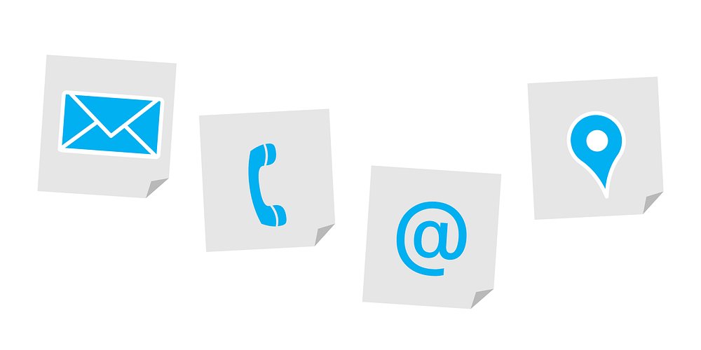
What is good about a website that people cannot contact the people behind it?
You may have great product and services, interesting and informative contents, and outstanding business performance. But if your website isn't giving a clear way for people to contact you, your website may as well lose them for good.
Not Approaching The Needed Audience
Who are your targeting? Where do they live? How old are they? What language do they speak?
There are a lot more question needed to be answered before knowing your targeted audience. So to speak, you need to make sure that the way you create your website, including its design and contents, are aimed to appeal those specific pool of audience.
Knowing your audience here will help you create the best marketing messages.
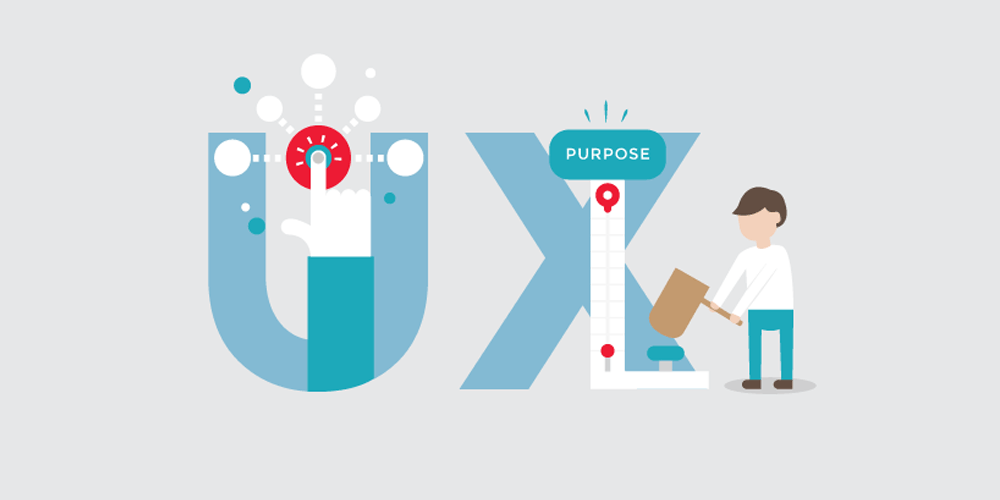
No Call-To-Action
What is the purpose of your website? This is what your call-to-action button do.
Call-to-action should be visible, eye-catchy and visible without scrolling. This will ensure that visitors landing on your pages will see that button.
Your website may have a lot of text, images, stories, descriptions of their product or business. They are useful and supportive, up to a point that they should make people convert into customers.
So when visitors are expecting something from you, show them the way to get what they want.
Not Having A Way People To Be Part Of You
When attracting visitors, you need to make sure that they can follow you and keep up with whatever you do wherever they are on the internet.
If your website doesn't allow others to follow your around the web, people will find it difficult to remember you. There is too many distraction on the web, and if potential customer can't recall you again, you're just wasting your time because you'll have difficulties in converting them.
Start by providing ways for users to register, having RSS or newsletter where they can subscribe, use social media networks and be active in the community.
Inconsistent Design
One page has one design and the other page has another design. This is something that people won't be at all expecting.
A website should be have all of its design come together seamlessly. The elements should work together to create similar look and feel across all pages. From colors, styles, typeface, effects, and others, they are your website's character. They should make your website unique, so there is no point of having multiple design for a single website.
Your website's interface which stands in the background, is quietly speaking its own language through user-experience. So besides consistency, there should also be a balance.
Outdated
Design changes, and here you need to keep up.
Outdated design is like showing people that you don't care much about your website. And if people think that you're not paying attention to the trends, they will think that your website is vulnerable and may pose them risks. This in turn will prevent them from becoming leads.
When redesigning your website, you should have one goal in mind: enhancing user experience. Whether it's about adding new features or a makeover, serve that purpose only.
Not Having A Side-Wide Login Function
Wherever your visitor land on your website, they need to see a login function (or register), if you're allowing them to.
If your website allows people to become members, they have to have a way to register and login. And because visitors may land on any pages of your website, it's wise to have a login function clear and visible in all important pages.
Too Many Choices

Links everywhere, too many toggles, questions and others. These will confuse visitors.
In the modern web design, people are expecting clear and straightforward feature. So here, less means more. Proper UX/UI involves reducing unwanted elements, not adding more unnecessary item on that same page.
No Proper Direction
Each and every of your web pages, should have a flow. You need to know what visitors are going to do next, and know how to direct them to the things that matter to you most.
For example, after landing on your page, your visitors will scan your page for interesting bits they're after. But then, where should they go? Without links proper good navigation function, your visitors may as well bounce away from your page, because clearly, they have no idea what to do next.
Here you're required to have some planning, which can walk your visitors right into your funnel.
Further reading: User Experience And Customer Experience: Connecting Their Differences For One Purpose