
Traditional desktop PCs may still be around for years to come, but in terms of web browsing, people are using their mobile devices much more often than their PCs. In order to meet the shifting trend, websites need to adapt in order to reach most of those people.
While web design is one thing, experience is the focus. Designing for desktop should have mobile in mind, and this is where experience is the key.
If visitors need to "pinch and zoom" to resize contents while visiting your website on mobile devices, you're losing a lot of those audience because you are not delivering the experience that is good for them
Most people that land on a web page that isn't web optimized will leave quickly. The reason is simple and clear: frustration. There is a disappointment in the mobile trend when browsing a web page that isn't optimized for small screens.
From unreadable text, images that are difficult to click to links that are not visible and not properly designed web pages. Users won't likely to stay long on that website, let alone purchasing something.
This makes it important for any websites to optimize their web pages for mobile in order to convert visitors into leads and then buyers.
The list below describes some tips that aim to get your website to show well on mobile web browsers and to appeal mobile users. The strategy here involves the usual basics on web design, but with some key differences.
Identify Your Website's Visitors
While there could be one solution that fits all, it's not wise to become the jack of all trades.
To have a high conversion landing page, you need to understand who are you dealing with. You need to know who are your customers, where do they come from, their typical browsing behavior and the reason they land on your website. Know these and show those people the things that interest them.
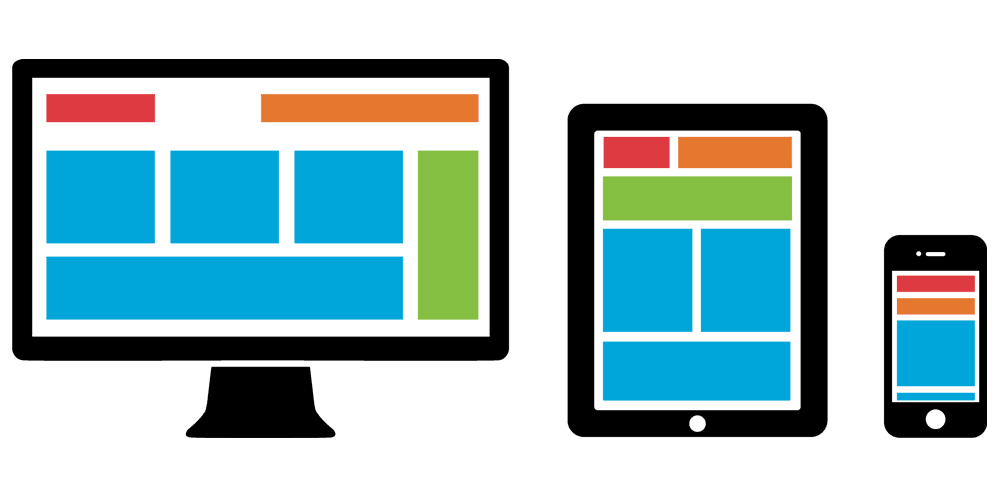
The next step is to create a responsive web design with mobile visitors in mind.
Optimize Page Loading Speed
Speed is important, and speed is everything. A slow loading page will bore users and won't catch their attention. Even a second delay can have a negative impact to your conversion.
There are several ways to optimize your website's loading speed. You can start by optimizing images by scaling them down the right size. Since graphics compromise most of a web page's size, you need to compress every images you have on your website, or opt to use a proper image format for the job.
Making images smaller in size will also help visitors in preserving their data plan.
The next is to reduce the size on your website's HTML, CSS and JavaScript. You can do this by enabling compression, which can reduce their size to 50 percent or more.
Your should refrain from using Flash or other plugins as they can considerably slow your website's speed down. Sometimes, some of them may even be incompatible with your visitors' devices.
If you want to appeal mobile users, your website needs to have speed as a priority, sometimes even more than when you design websites for desktop users. Mobile users tend to be in a hurry, may have limited data plan or using unstable/slow internet connection.
Related: The Common Practices Of Web Design With Speed In Mind
Minimize Distractions
Users using PCs have significantly larger screen sizes. In terms of web design, you can put a lot of design elements without even disturbing the proper white space experience. However, mobile users don't have that luxury.
Whether it's a desktop or a mobile landing page, it's very easy to get carried away with images and text. You can put more information to a page hoping that users will get busy in exploring new things you are showing them.
But again, on a large screen, this is possible. On mobile devices that are much smaller, any elements added can increase clutter and distraction. When there is more than enough information on a page, further element is just a useless distraction that will chase away potential customers.
In order to minimize distractions, it's also wise to not use popups either.
To optimize conversion on a mobile web page, you need to focus on your Call-to-Action button and headlines. The rest should be kept down to a minimal.
If your website's page needs to show a lot of images, consider using lazyloading among other things in order to keep your website fast without sacrificing experience.

Design For Touch
Creating a mobile-friendly website isn't limited to how it looks. It also includes how it should behave.
Since touch-enabled mobile devices are taking most of the market, your website needs to embrace that fact. Since mobile users will be using their fingers instead of a mouse or a precision mouse pointers, you need to make your pages easy to navigate with fingers of all sizes and shapes.
Use proper proximity and spacing between elements and use white space to make them less cluttered. Inaccurate taps are very common on small devices which should be accounted for in the design with large enough touch inputs or gestures to get the job done.
Furthermore, if your website highlights a gallery with carousel, for example, it is best if you make that feature touch-friendly.
Related: Making Your Simple Landing Page An Attractive Opportunity