Microsoft was one of the earliest using the flat design, that makes use more colors and shapes to establish a more modern look.
But as the trends somehow passed as almost everyone in the business is adopting that same "flat" appearance, Microsoft is evolving its aesthetic into something a bit more three-dimensional.
After unveiling Fluent Design which adds depth, lighting, motion, and more, the design language is arriving to Microsoft Office in a big way.
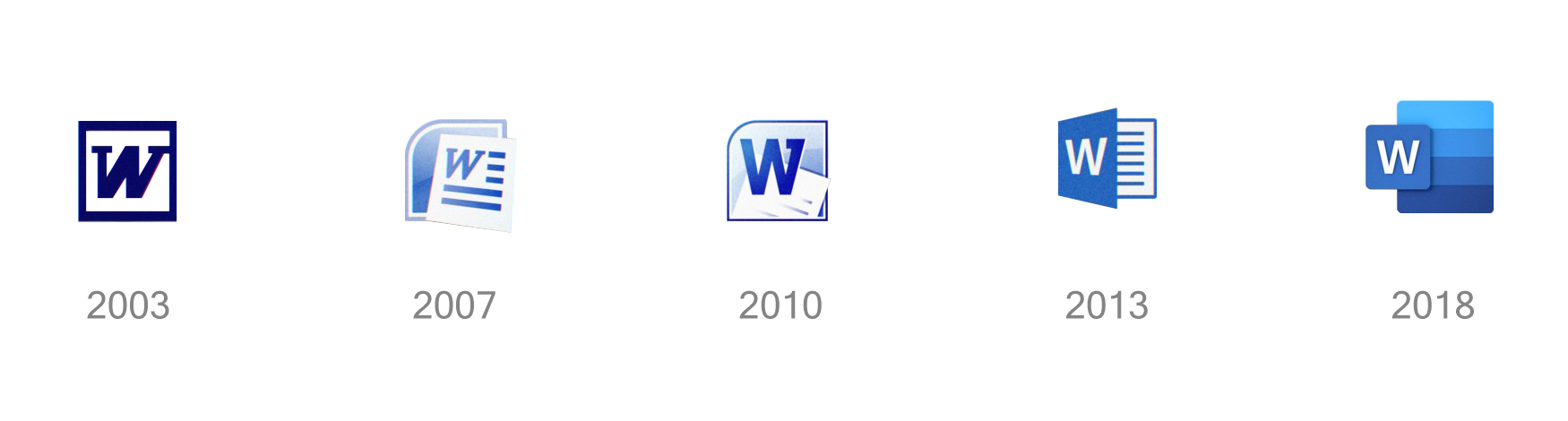
In a Medium post by lead Office designer Jon Friedman, Microsoft said that the world has changed a lot since 2013, the previous time it redesigned its logos.
Back then, selfies and emojis were new concepts, AI was only just starting to get traction, and people were more likely to save their documents locally rather than in the clouds.
Fast forward to 2018, things have changed.
The refreshed Office logos are meant to reflect a more modern aesthetic and a more modern Microsoft, based on the principles outlined in Fluent design.
With Office spanning across multiple devices and platforms, Microsoft has been building a single core codebase to make rapid monthly improvements to the apps.
These icons are designed to reflect how Office has changed, like with AI features, more collaborative features, and its platform independence for key apps like Word, Excel, PowerPoint, and Outlook.
What the logo design updates are trying to highlight, is the layered accompanying the symbols. By adding a sense of depth, the logos appear to more fluid and seamless, as Microsoft wants its Office products to spark "opportunities in 3D contexts.
The symbols are also larger than the letter to emphasize the contents users can create with the tools.
Before the icons were meant to reflect with the folder in which the documents of the appropriate type can open. The updated design however, is giving each icon to develop its own concept appropriate in application role.
For example, Word for the first time since 2007, lost in its logo a sheet of paper, and with Excel has an angular shape, but different colors. PowerPoint shows you a pie chart in Microsoft Teams, a symbolic notation for people.
"This is the beginning of a cross-company effort to update all icons in the same style," said Friedman.
"Color differentiates apps and creates personality, and for the new icons we chose hues that are bolder, lighter and friendlier — a nod to how Office has evolved."
The refreshed logos are a major step forward.
Previously, Microsoft has only been making slight iteration tweaks to the identities of its Office apps. This time, it's a pretty major one.
This is also to make Microsoft in able to position itself as friendlier to artists and creative people.
Design wise, this is how Microsoft is focusing on making its products "builder, lighter, and friendlier."
To say that least, the design is a welcome move from Microsoft that wants to differentiate itself, by putting forward its Fluent Design language. The company has designs that was inconsistent over the years. The update here, is like showing how sign times are again changing.
The updated design of the logos are meant to appear in Office apps for Windows, Mac, iOS and Android, as well as web-services.