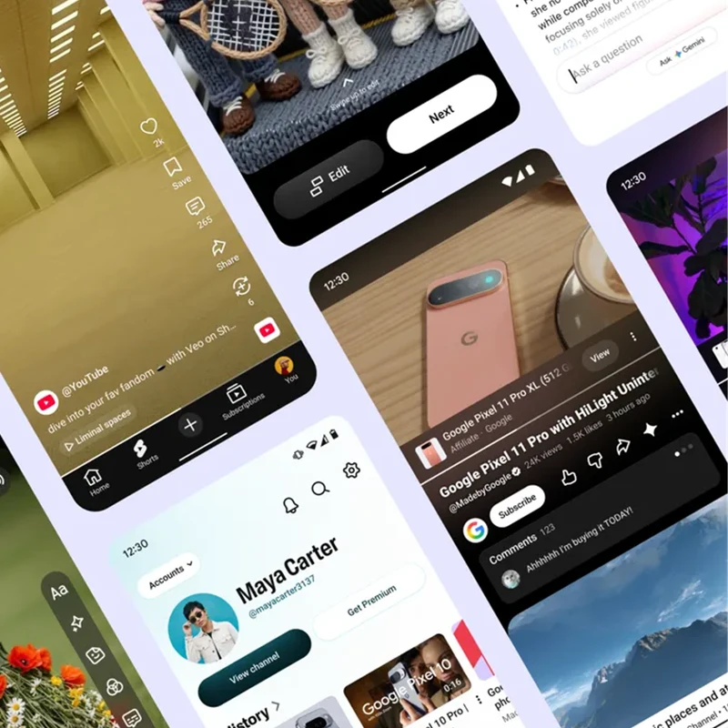
Digital platforms that host video have long balanced the pressure to surface useful tools, recommendations, and monetization options against the simple fact that people arrive primarily to watch.
Over successive product cycles the accumulation of buttons, cards, banners, and interactive layers can begin to compete with the material that drew the audience in the first place.
Design teams at major services have therefore started formalizing principles that try to tip the scales back toward the content itself.
YouTube recently made its approach explicit.
In mid-August the company's chief executive outlined five core design principles intended to keep the interface quieter and more focused while still supporting creators.
A week later he returned to the first of those principles, summarized as making content the star.
The practical illustration concerned shopping features that appear while a video plays.
Previously, product information could surface as overlays placed directly on top of the footage.
Those overlays have now been relocated to a shelf that sits below the player and appears only when the system judges the products relevant.
The change keeps the commerce function available yet removes it from the same visual layer as the video, so that the creator’s work remains the primary object of attention.
The fuller explanation appears on YouTube's own blog post, where the same five principles are laid out in sequence.
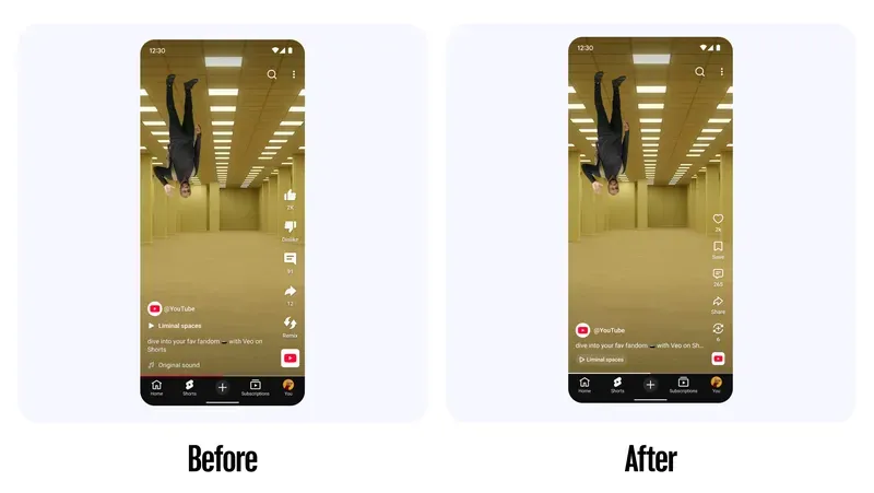
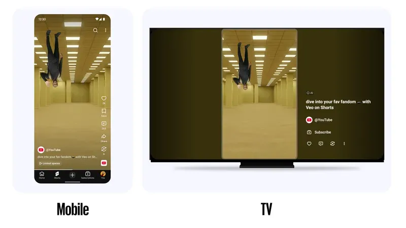
Making content the star is listed first and is illustrated by both the shopping shelf and by the decision to dedicate more pixels to the video itself on Shorts.
The second principle calls for prioritizing relevance ruthlessly, tucking non-essential buttons and menus away so the screen stays clearer; this has already been applied to the Shorts player through condensed titles and fewer right-hand icons.
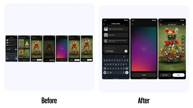
The third principle favors the simpler option, removing redundant steps in creation flows.
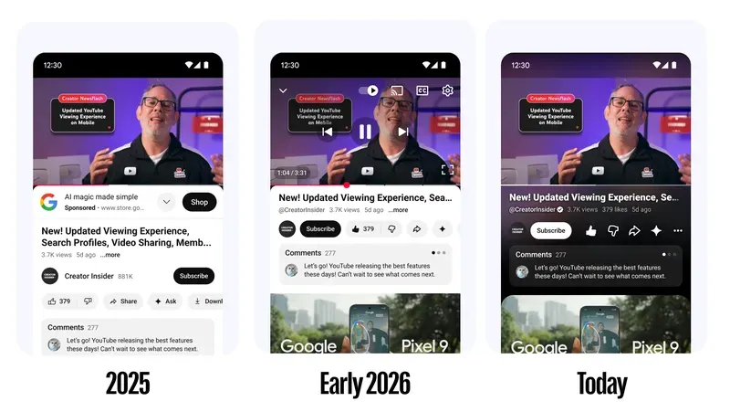
The fourth emphasizes consistency across the app so that familiar icons, typography, and layouts help users orient themselves. The fifth asks teams to build for the ecosystem, ensuring the experience remains coherent whether someone is watching on a phone or a TV.
Taken together the principles reflect a redesign effort that has been underway for more than a year.
The stated goal is not to strip away capability but to present it in ways that interfere less with viewing, preserving muscle memory while steadily reducing visual noise. The shopping shelf is only the first public example; further details on how the remaining principles are being applied are expected in the weeks ahead.