 Everyone have different taste. Guided with their own unique tastes and friends, people explores the world differently. To create localized search for its users, Foursquare, the location-based social network, is rolling out a brand new version that is all about its users.
After it pulled the traditional check-in and launched a new, standalone app called Swarm, the company is giving its existing discovery and location-based recommendation app an entirely new look and feel, including a new darker shade of blue typeface.
With the new Foursquare, no two people view the world the same. So no two people will have the same experience with its mobile app. When first starting updated Foursquare, the app will ask several things before becoming fully tailored to the users' taste.
This new app is centered around personalization and recommendations.

Inside the app, users will find a new navigation bar at the bottom, with the options Find a Place, Here, Tips and Profile. The first option has large segments recommending nearby places and businesses that cater to the users' specific tastes. A search bar is shown prominently at the top and there's a horizontal carousel underneath for selecting specific destination types, such as Lunch, Brunch, Breakfast, Coffee and Dinner.
Swarm works seamlessly together with Foursquare. If the user uses both Swarm and Foursquare, they will see that on the left, a venue page for a person who only uses Foursquare, and on the right, there is a check-in button if they have Swarm installed. There is also an additional option that appears only to users who have Swarm installed on their device.
Foursquare is shifting all check-ins over to its Swarm app. When that is over, check-ins using the Foursquare app will no longer be an option.
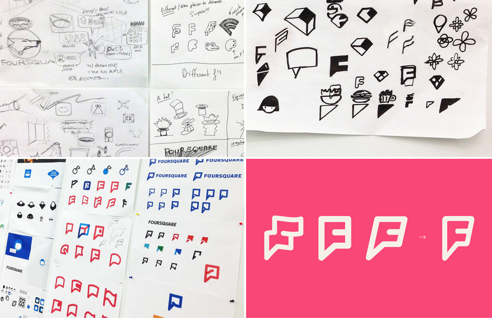
And to highlight its rebranding effort, Foursquare is also changing its logo from the check-in checkmark to represent the new pink 'F' logo design by having a mix of map pin and superhero emblem. Foursquare CEO Dennis Crowley suggested that the F-flag is a mark of Foursquare's new recommendation superpowers.
"This is the beginning of the 'personalized local search' future we've been talking about since we started Foursquare," said the company in a blog post. "It's been built with the help of our amazing 50,000,000-strong community, with all your tips, check-ins, photos, and the smarts we layered on top of that."
The new logo was designed in collaboration with Brooklyn, NY-based Red Antler. The logo change is relevant and has been well done, and it's a clear case of Foursquare wanting to establish a fresh beginning, moving away from any remnants of its original identity in order to rally users for its new functionality.
The rebranding effort is a fresh start for Foursquare. As the company shifts away from a gamified experience and starts using years of data to compete with Yelp and Google. But the recent changes are quite significant that the company have to work on helping existing users to understand the differences between the apps so that the experience is an seamless as possible.