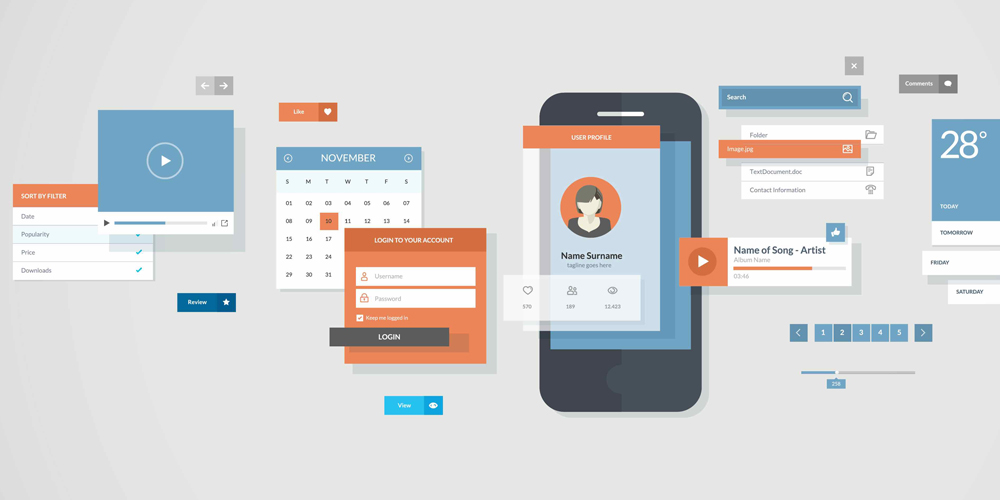
Google's Material Design has become the universal design language for Google products and Android.
The design highlights "flat" graphical interface, bold and bright colors with only the most subtle of shading which, on screen, looks like it is a physical entity rather than just a bunch of code and pixels. Introduced alongside Android version 5.0 Lollipop, the design has come to numerous products ranging from mobile apps to web design.
With the company's attempt to make the design language universal, it's now putting a lot more Material Design to iOS apps.
For Google, it's the company's way to introduce its brand in the form of design to Apple's users. Up to a point, that it's a sale strategy. But on the other hand, the design that is a competitive opposite to Apple's, has put anger to Apple fanatics. Google has introduced Material Design to iOS since early Lollipop debut, and since then many iOS users aren't happy.
For example, in a thread on the Apple subreddit, hundreds of users have shared their thoughts about Google in entering Material Design to iOS, and most aren't liking it.
Their comments range from Google's total disregard for iOS norms, the lack of a back swipe and the design placement of buttons, to the overly flashy 'obtrusive' style, functionality and so on. Some even commented that they aren't anymore enjoying Google's app or services on iOS anymore because of it.
9to5Mac called Material Design on iOS "dumb as well as rude". And according to Macworld, Google is "making the same mistake now that Microsoft did in the 90s" when it introduced Word 6 inflicted Windows for Mac users. Mac versions of Microsoft's apps vanished, replaced by programs that didn't behave like Mac apps at all.
Google is said to make more money from iOS users than it does from Android, the overly assertive design style is seen as a bad idea because it only serves as a push away for iOS users.

Design Language, Something To Respect
Software makers have put design to put their product more intuitive, useful and able to provide great user-interface. The goal is to create the best user-experience out there by leveraging their brand's design as a character and a selling point to differentiate themselves from any of their competitors.
But as others do have their own design language, companies should respect others' platforms. This is crucial since fellow competitors can create apps on others and sell their services there. Not just that, fanatics of a product tend to adore the device they use no matter what, so respecting others' design language is a way to get their hearts without annoying them.
Many people see Google's move as a strategy that shouldn't be done. If a developer (Google) is going to release an app for other platforms, it should make it look like the platforms' native apps. So when introducing apps to iOS, people expect Google to make its apps to look like iOS apps, and vice versa for Android apps.
Material Design suits well on Android because Android is Google's. What this means, Android users do expect Material Design, iOS users don't.
In Google's case, it might be that the company wants Material Design to sink its teeth deeper into iOS so users will want to switch to Android. There are also speculations that Material Design on iOS is simply because Google is just lazy to spend more development time and money to tweak its apps' design to match iOS's design.
But again, design is always subjective and Material Design is no different. The design language has already garnered a lot of fans and fanatics, as well as foes and haters. While for Android users Material Design is more respected, the use of the design outside its territory could be intrusive. But users aren't forced to like it because at any ways, design is just one of the many selling points of a product.
Google's sheer size over the market has made it reign for long; making people difficult to live without it. While yes a design is fundamentally important, but it takes many features and credibility to give services that people do like.
Design isn't likely to make any iOS users to switch to Android. But no matter what, Google is still having that power to influence. In so many ways, Google is seen as the modern equivalent of Microsoft in the 90s: It makes an operating system used by the majority of the market, running on an array of hardware from many vendors, powerful and ubiquitous. And for that matter, it's not unusual that Google is the target of rage.
So even if Google's Material Design isn't appealing many people, at some points it really nailed Apple's coffin on several products. Like Google Maps for example, Google has excelled Apple in navigation by margins. But even if Material Design is expected to enter deeper into iOS, it won't necessarily make iOS users to ditch "Hey, Siri" in favor of "OK, Google", for example.
It takes more than design to appeal something. Google has its own advantage and so does Apple.
While many of users aren't liking Material Design in iOS, there are actually people who do like Google's design on Apple. Again, this is perspective that could differ from one person to another.