
For people that use computers to write, they certainly know that it's important to use a minimalist text.
But the thing is that, legible fonts that suit both reading and writing aren't many. Most fonts are created for reading, and not for writing.
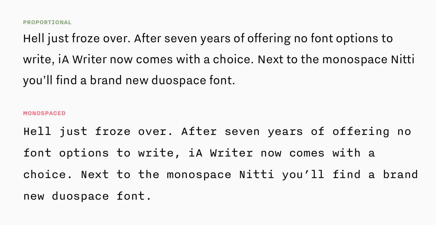
Most fonts are "proportional fonts", which are optimized for high reading speed. Most fonts are created to do this. But for "good writing." things should be slow, measured and reflected. "It takes one step at the time."
This is where iA, a Zurich-based team that made writing app for mobile and macOS, set out to create another font that’s better for writing than for reading.
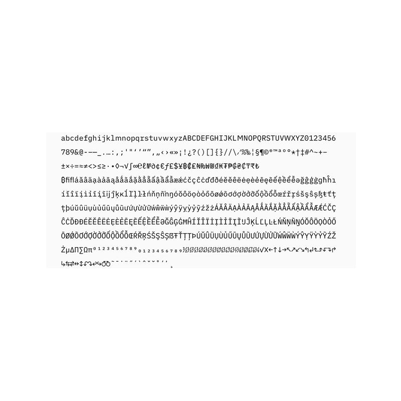
Previously, the company already offered a monospaced font called Nitti in which every letter, every number, every punctuation mark and every space takes the same horizontal visual space.
"The typographic rawness of a monospace font tells the writer: 'This is not about how it looks, but what it says. Say what you mean and worry about the style later.' Proportional fonts suggest 'This is as good as done' and stand in an intimidating contrast to a raw draft."
"Proportional fonts save space. They suggest that you 'hurry up and fill the page.' Monospaced fonts, on the other hand, feel more productive."
To create a better alternative, it decided to create a duospaced option that gives 50 percent more space to the letters m, M, w and W.
Here’s an example that shows the difference between monospace and duospaced fonts:
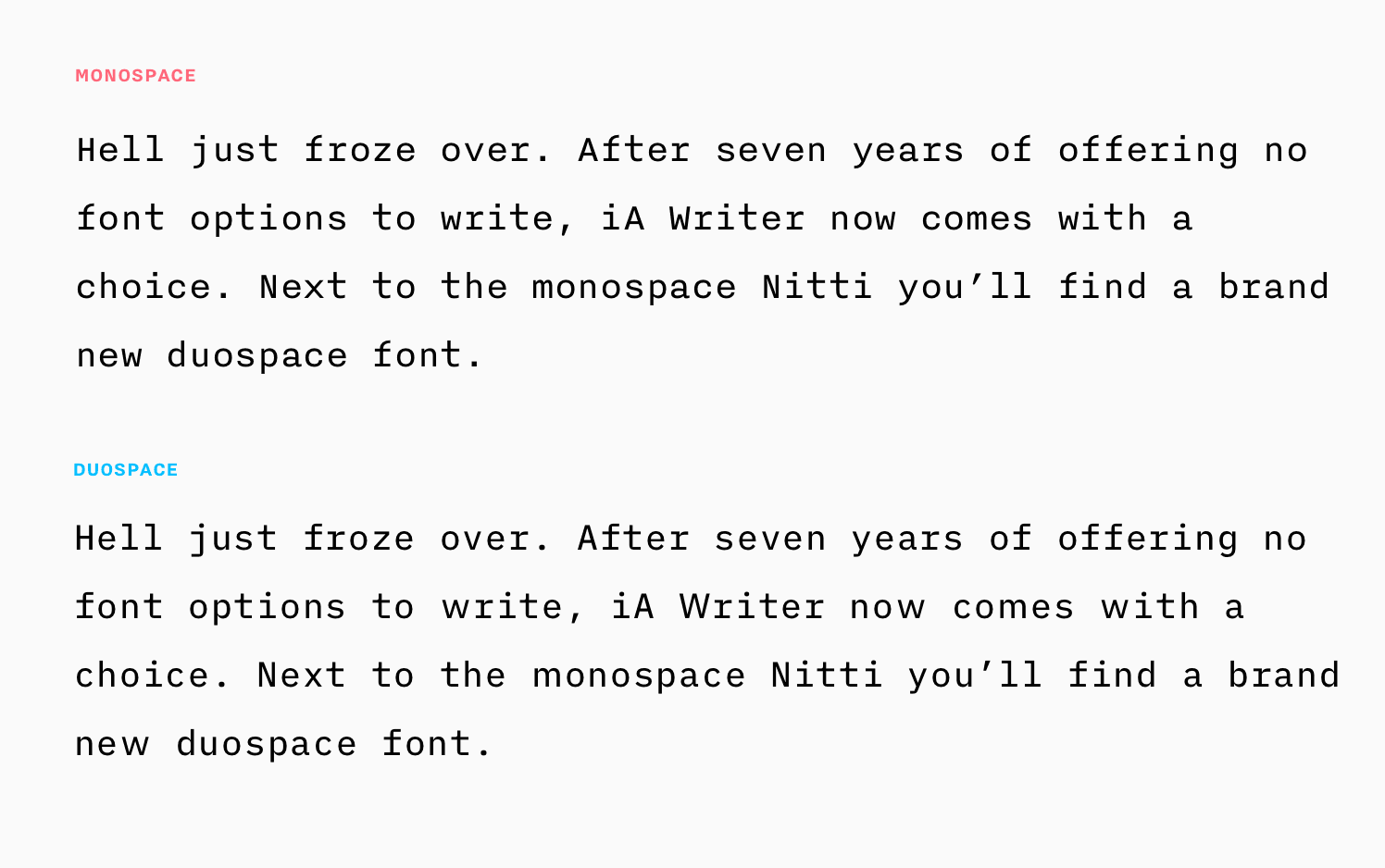
According to iA, duospaced fonts fix the problem of squishing those naturally wide letters into awkward tight spaces.
As a result, duospaced fonts should create a better flow while still retaining all the benefits of monospaced screen fonts: "the draft like look, the discernibility of words and letters, and the right pace for writing."
Not only that this type of font benefits blog writers and other alike, it also benefits programmers because it allows them to easily spot typos.
iA Writer Duospace was built on IBM’s Plex typeface, which has been unveiled and made open-sourced. And just like Plex, Duospace that comes in four weights, is also available for download and use in users' preferred text editor for free.