

The microblogging platform Twitter is making a few updates to its design, tweaking the looks and feel across its web and mobile apps, as well as to TweetDeck and Twitter Lite.
The design isn't radical, and is seen as more of an update rather than an upgrade.
First, the company introduces simpler set of icons for things like replying to tweets and a cleaner typography that is more consistent. The design also highlights more rounded shapes across several of its elements, making practically anything that was previously square is now rounder.
The update also introduces an accessibility option for mobile users to change color contrast across the interface.
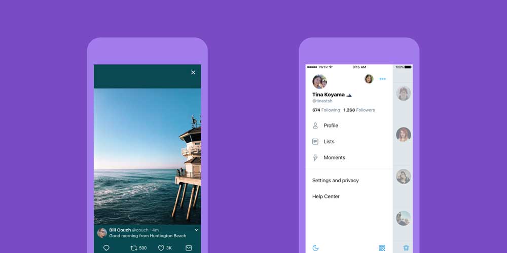
The most significant design update can be seen on its app for iOS. Catching up to its Android counterpart, Twitter redesigned the navigation menu so it's away in the left-hand side panel.
Twitter is also adding a new profile photo button in the top left-hand side.
So when users click on that photo, a menu that includes settings and privacy controls will slide out. By replacing the 'me' tab that was previously shown along the bottom-side of its iOS app, the design tweak decreases the clutter at the bottom of the its iOS app.
The iOS app also updates how it opens links. So when users tap on links, the app will use Safari's View Controller. This is a convenience because when users tap on links, they don't have to log into sites they've already signed into on that browser.
Other advantages that come with Safari's Viewer include support for AutoFill, fraudulent website detection, and a respect to the Do Not Track privacy setting as configured in users' iOS settings.
The design update is minor, but indeed a welcome move by Twitter. This is one of its efforts to appeal better to new users.
The update focuses on the looks and feel, as well as tweaking some of the usual things users do when interacting with Twitter.

One of the example is the reply button. The icon for the feature was fairly standard and recognizable, But in an effort to appeal to "newbie" web users, the reply arrow has been swapped out in favor of a more modern conversation bubble.
Retweet, Like (heart), DM icon, Home, Search, Notification have also been changed.
"More intuitive icons make it easier to engage with Tweets - especially if you're coming to Twitter for the first time," explained Twitter in its blog post.
Overall, Twitter looks modern and a bit cleaner with this update.