Companies can have their own design language. Not just to appeal users, but also to differentiate themselves from the competition.
The same goes with software products. Google for example, has what it calls Material Design, and Microsoft also has its own design language it calls Fluent Design. They have all managed to become distinct in their own means.
The next that also wants to leverage its own design interface, is Samsung.
At its Samsung Developer Conference, the company showcased what it calls 'One UI', and started a different approach to user experience on Samsung phones.
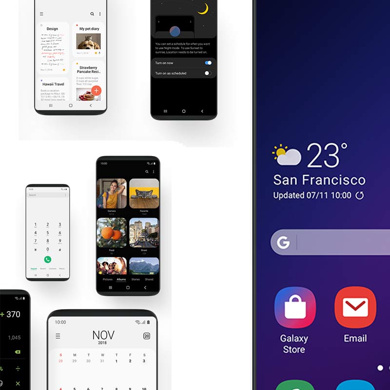
The One UI design contains some visual aesthetics, like splash of colors, rounded corners and redesigned icons, as well as some functionalities that come with them.
But its main purpose here, is to relieve the repetitive stresses its users have endured when using big smartphones.
First of which is the most prominent, is Samsung in placing the key interaction areas near the bottom of the screen where users can easily reach with their thumb. Considering that smartphones are getting larger in size, but having thinner bezels, Samsung sees this as an opportunity to introduce keys that are easier to access.
Here, owners of Samsung phones with One UI are no longer required to reach for the top left of their Galaxy devices for specific actions, for example. At the same time, this also improves one-handed usage.
Samsung said that the One UI is the "most user-focused smartphone UX" it has produced to date.
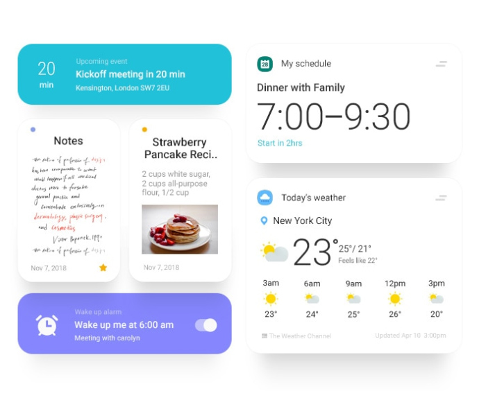
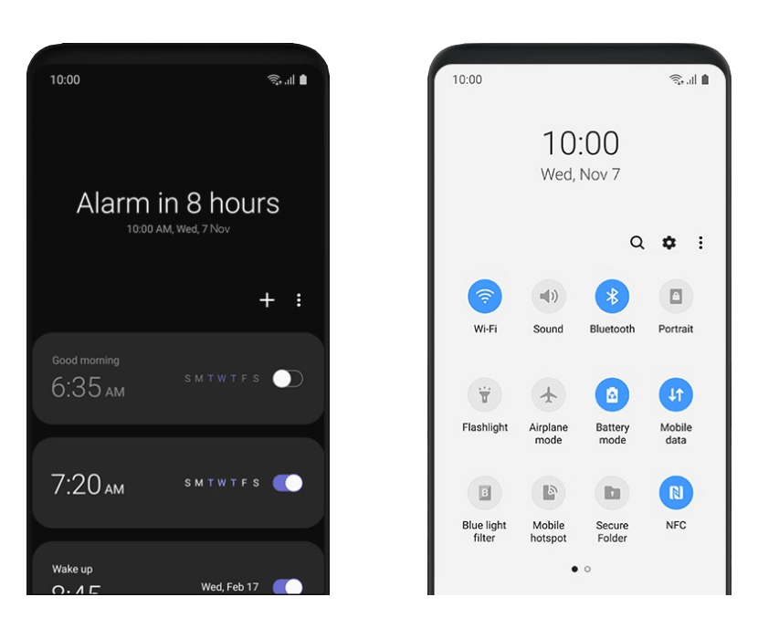
The next is how Samsung treats its apps. As users know that Samsung phones are packed with several bundled apps out of the factory, Samsung is making those apps easier to view, with a "viewing area" that is big, easy-to-read header text, and an interaction area covering the lower half of the screen.
This way, users can interact with the system with one-hand way more easily, as everything should be within your thumb’s reach. Accessing the navigation bars, buttons and the rest, no longer require finger gymnastics.
This viewing/interaction area spans to the entire Samsung’s UI: from the Messaging app, to the Dialer, to the Clock, to the Settings menu, to the notification shade, and the Quick Settings panel. Many parts of the of the stock Android were redesigned with ease-of-use in mind.
"The experience was reengineered to reduce clutter and distractions, allowing the user to better focus and quickly navigate their phone," Samsung said in a press release.
Other improvements include a dark mode. The feature comes with a simple setting, and changes the entire user interface - which is normally all-white by default - to black.
This dark theme that applies to the notifications, notification shade, the Settings menu and all of Samsung's pre-installed apps, should make experience different. And because Samsung phones use AMOLED display, the dark theme should also prolong battery usage, as pixels in the display when black won't consume any power.
And speaking of themes, Samsung also mentioned that the UI can take on colors depending on the color of the device.
The One UI is the successor of 'Samsung Experience' design language and user experience, which is in turn the successor of TouchWiz which had its own share of controversies.
As One UI is an Android Pie-based software, Samsung has designed it by taking cues from its previous Samsung Experience, and make it more or less similar to Google's so-called Material Design 2 which boasts more white space and rounded corners.
But what Samsung did here, is more than just a redesign. The company UX goes further by reimagining the way users interact with the software, as it focuses on simplification, ease of use, and making everything more visually appealing. It removes clutter, making it more seamless and natural.
"With One UI, users only see what they need when they need it so they can stay focused on what matters," said Jee Won Lee, Samsung senior designer of UX design.
So here, One UI is a pretty substantial improvement over the Samsung's previous design.
One UI is first introduced as a beta, and is set to roll out to users in the U.S., Germany and Korea, followed by more countries in Europe and Asia.
The first devices to have the One UI, according to Samsung, would be the Galaxy S9, S9 Plus, and followed by the Note 9 starting in January 2019.