
Realize it or not, we're all constant guinea pigs to web designers, especially engineers at Google's and other big titans of the web. Different colors and different shades matter a lot although they only have a slight difference.
Why? Because the differences in link colors, no matter how small, can affect how people will react when seeing them.
They may encourage, or even discourage people in clicking on them.
For example, Google uses blue as its main link colors. Its Gmail however, uses a slightly different shade of blue. The reason for this is because Google discovered that blue color for links do encourage people for clicking on them. It's natural for Google to choose that blue tint to make people use its services more.
The more people use Google, the more people will eventually click on Google's ads. That goal is Google's core business, and there is no denying that Google wants that.
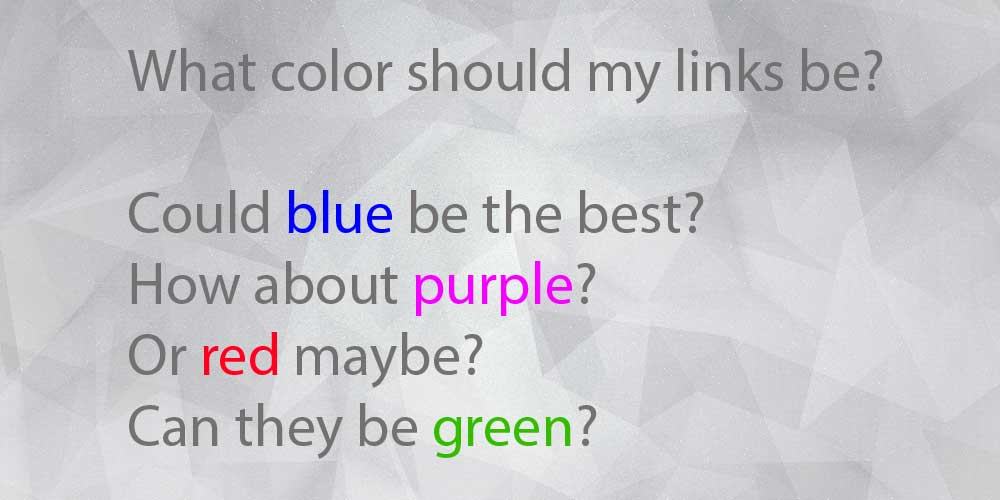
But is blue an utterly absolute color choice for a proper link? Is it really true that people are more attracted to blue links rather than green, red or others?

Before concluding which color does best, you must first know that links are the most basic interface on any websites. And for that reason, any links should be colored. The main reason for this is to differentiate those links from plain text. Because they're distinguishable, people know that "there must be something about them."
Remember that users rarely read; they scan. How often do you actually read every single word out of a web page in order to understand what it wants to say? Not that often.
So links should stand out not only from the background or the surrounding text. But also to all elements in their surrounding proximity. This ensures visitors to quickly catch what they can interact with, and see what a sentence is all about.
Now for the blue color. The reason why it's widely used and popular could be traced back to the history of the web: back to the origins of the web with Tim Berners-Lee, each new page had to link to another. While they connect all contents together and come in many forms, they were and are all blue.
The first web page ever created on the web is http://info.cern.ch/hypertext/WWW/TheProject.html. Here we can see that blue was, and still the color of choice.
CERN's website is a good example. Other early websites used (and still) follow the "leader" by using blue-ish colored links. As modern websites are created, blue is still a standard color for links, and for this reason, websites should avoid using blue color on non-link texts.
As standard, links that aren't yet visited can have the color ranging from the color #0000EE to #0000FF. Visited links usually use the color between #551A8B and #800080. But here is the thing: these colors are only good when nearly everyone use them. Otherwise, users cannot anticipate the reaction of their action, and the result is that they couldn't predict the site's behavior.
However, almost every modern websites available on the web don't follow those color standards anymore. Why? Because web design is evolving, and sticking to a single shade of color and its variation will limit how web designers in delivering messages through images and other interactions.
The result is pretty simple: people who are relatively new to the web (not those people who came to the web in the 1990s, for example), will not be that aware of the color standards. although this color choice has passed on to the next generations of internet users, and now they also have gotten more familiar with blue, they have a tendencies to conclude that colors of links are just aesthetics to differentiate links from ordinary text.
Blue still perceive the strongest affordance of clickability because of its distinct color, so it's advised that if at all reasonable to use blue, then use blue. But when web design and interactivity come to hand, blue that is still necessary, isn't anymore a must.
For this reason, colors other than blue has a chance to pick up traction.
If you see that blue is just not your color, you can style them by looking at CSS selectors and pseudo-classes:
a:link { }for links not yet visited. These links links should be more vivid, bright, and saturated than the color for visited. This is to encourage clicksa:visited { }for visited links. They should look "used", "worn", "dull" or 'washed out". They need to look darker in shadesa:hover { }for the color when user mouses over a link. This is to show that a link do work, and people can expect something will happen when it is clicked.a:focus { }for the color when user clicks on a link. The color you choose should represent an action; telling users that the link responds to the user' intention.a:active { }when user has clicked on a link. This is necessary to tell visitors that the link is doing something, and their input was received.
Again, change them only when necessary. Blue is still the most recognizable color for links, so customizing colors from their default colors, especially when your website is already online and have frequent visitor should be done with caution.
Any changes, especially on link colors, could affect how visitors will react when seeing them. If the color of choice match well with your website's design, you may have an increase chance of people clicking, and of course leveraging your brand through color psychology. Otherwise, a sudden drop of clicks could make your website 'alienating', increasing bounce rate or limit visitors to just a single page visit.
Blue isn't anymore the specific color prominent as the color of links; being distinguishable is. While the color and its various shades variations are still widely used, they aren't necessarily make your website to have more clicks, of course with exceptions. Like for example: blue-ish background to have blue links, or for websites with multiple blue color variations for web design to have blue as links.
And as an advise, don't underline text that isn't linked because users expect underlined text to be a link. And keep in mind users with poor sight and color blind. Red won't stand out to them, so consider underlining or bolding links, in addition to just changing the color. This is important to your website's accessibility.
Further reading: Playing with Colors and Improving Your Website Readability to Expand Your Market