
One good thing deserves another. But that good thing also deserves to be copied. After Instagram and Facebook copied...
One good thing deserves another. But that good thing also deserves to be copied. After Instagram and Facebook copied...
The social giant Facebook has a feature called Safety Check, a powerful and useful crisis response tool. It's...
The microblogging Twitter has released QR codes, a feature that can make the process of following others a lot easier...
Counting weeks to the end of the year? Google have updates, just in time before holiday photo sharing.
The first is...
Mozilla has released Firefox version 50.0 on November 15, 2016. The stable version of the Firefox was postponed in order...
What do messenger apps have in common? Chatting features, camera access to take pictures and videos, emoticons, stickers...
Out of the many desktop Skype users, most of them usually want to do one single thing: they want to start a conversation...
Google's Play Store has more than 2 million apps users can pick from.
With that many to search and choose, discovery is a major challenge for users. And that is a concern to both Google and also app developers.
While searching for famous and popular app won't be that difficult, many others will stay down below the surface. Here is where artificial intelligence (AI) comes to work. By having neural network to aid the human touch, Google can figure out better which apps belong in which categories.
According to Google's AI researchers on November 8th, 2016:
AI with the technology called neural network, works by loosely mimicking how the human brains work. On the Play Store, Google processes the app names and their description, to then try to figure out which ones to show in the search result.
This is because AI can be designed to do a better job in sorting apps according to categories, especially when there are many of them to choose from. With the attempt, Google is focusing to balance new apps with popular standbys, take out malicious apps, and help developer to get their own apps to show up high in search results.
In order to make this happen, Google trains the system by creating very rough approximation of language-centric learning. The team trained the neural network to learn how language was used to describe apps. By using a Skip-gram model, the team can make the neural network predict the words around a given word. After that, the neural network encodes its knowledge as embeddings where they can be then used to train another model called classifiers to distinguish which topics apply to which apps.
While the architecture produced good results, it would sometimes overgeneralized. As the team explained, it might associate Facebook with "dating" or "educational games."
To produce more precise classifiers, the team needed a lot more data to train the system. Here is where humans take their role. The data that is funneled can be evaluated by human raters to get the classifier output, to then feed it back again to the system. The process allowed the team to bootstrap the existing system, giving them a way to improve classifier performance.
And because the AI solutions learn more about users' habits and preferences and make better recommendations than they currently do, Google allows people to assess how well the categorization worked and thus steer it toward even better results.
Besides putting AI into a good use by helping how the Play Store works, Google is also making some visual changes to the Play Store. So here changes behind the scene follows minor redesigns at the front.
The changes aren't drastic and are more cosmetics than an overhaul. The focus here is to make Play Store less cluttered.
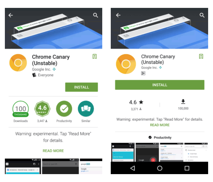
At first, the green background has been given a darker shade, and each app's page has been given a larger install button and the app ratings are also made a lot more distinguishable. This should make call-to-action more prominent, putting engagement first before information.
Additional changes include the removal of the box which listed the appropriate age category for the app. Badge is also removed.
The new UI still shows the average stars received by the app by users, along with an approximate number of downloads. While these stats are no longer posted inside a badge, they remain displayed under the larger install button. Other changes include larger screenshots of the app, and a new position for the "Read More" link that expands the description of the app.
App carousel on the main Play Store page has been made a bit smaller, and the "More Information" page that was previously located at app description has been relocated above the developer's information.
The new UI was first spotted on Nexus devices running Android 7.1.1. At the moment, Google seems to be settled with the Play Store's current design. Adopting Material Design with colorful visuals, the minor adjustments are more based on user testing than its own willingness.
In addition to the above, Google also wants to expand Play Store's support to more payment methods, introducing numerous new tools aimed to help developers monetize their creations and expansion to Daydream, Android Wear 2.0, and more Chromebooks.
With all the above, Google is planning to help developers to cope with increased competition by expanding the Play Store ecosystem as a whole.
Google and Apple have different taste in design. While Apple opts for "dull" but useful design interactions, the former likes splashy colors and attractive visual cues.
To push more of its design language forward into Apple, Google revamps its Gmail in what it calls "the biggest overhaul of the app in nearly four years."
"When you get the next Gmail iOS app update, you’ll notice some exciting changes," said Google on its November 7th, 2016 blog post.
The first up is the new looks. Gmail for iOS now looks a lot more like its Android counterpart: Material Design with a red-colored bar up on its display. By having more of its Material Design-oriented products running on Apple, Google is further pushing its brand influence to the faithful competitor.
While most of the changes are just plain aesthetic, Google also introduces some new features.
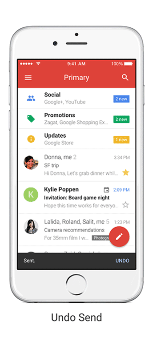
And as for the new features, the first is the Undo Send. This feature should come in handy when users realized that they've made a mistake soon after sending an email. Almost immediately to a few seconds after sending a message, users can tap "Undo" at the bottom of the screen. With this, users can prevent embarrassing moments when sending wrong emails to the wrong person.
In the meantime, Gmail for Android has yet to have this feature while Google' own Inbox app already does.
The next is the speed. Google said that it sped up its search with 'instant' results, and also provides suggestion while the user type. And for last, users can also swipe to the side to see archive and deleted emails.
According to Google, these can make the overall user interactions with the app a lot faster.
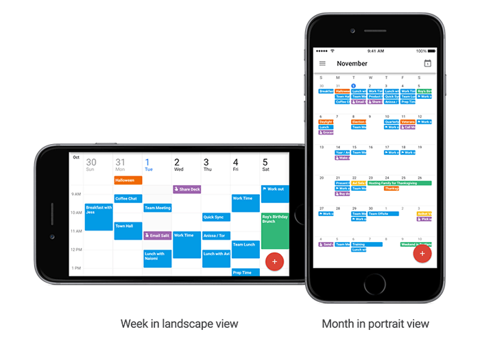
And not just Gmail. Google also makes a few update to its Calendar app based on users' feedback.
YouTube is still renowned for being the platform behind many videos on the web. In order to bring better experience for its users, the video-sharing platform has brought features including supports for various formats: from HD to 4K videos, 3D and 360-videos as well as spatial audio.
In November 7th, 2016, YouTube announces a support for High Dynamic Range (HDR) videos. The format enables supported devices to showoff more vivid and eye-catching visuals.
By supporting HDR videos, YouTube is having a major quality update. HDR isn't about resolution (users won't see the differences seen from 1080p to 4K resolution, for example). But it enables videos to take a better advantage of the given resolution to show better pronounced visuals.
HDR videos have a higher contrast for more detailed colors and better clarity. Supporting a wider color gamut, HDR videos can be more vibrant.
Simply put, according to YouTube, "HDR unlocks the most spectacular image quality we've ever streamed."
As a start, YouTube is working with creators like MysteryGuitarMan, Jacob + Katie Schwarz, and Abandon Visuals to bring contents in HDR. And starting at the moment of announcement, video creators can upload HDR videos to YouTube.
And to make things easier for users, YouTube has also worked with the DaVinci Resolve team to make uploading HDR videos as simple as SDR.
The above picture is an example of SDR and the picture below is HDR. We can see the contrast difference as well as brightness. HDR can display a more eye-catching colors with better clarity. This is because HDR videos allow a greater range of colors between the brightest parts and the darkest parts.
HDR videos are similar to HDR photos. The difference between the two is that HDR videos require HDR panel to display the full range of tones. The panel also needs to be set bright enough in order for users to see the difference.
Starting at the day of the announcement, users can watch YouTube videos in HDR format on supported devices. Using Google's Chromecast Ultra, HDR TVs, SUHD or UHD TVs, for example. If users don't have the supported devices, videos will still play, but in its dynamic range.
While HDR has potentials, the moment sees a problem: high-resolution TVs like those that support 4K aren't yet in everyone's home (let alone those with HDR). There also aren't that many computers with proper HDR support yet, and the only phone with official HDR implementation was the Galaxy Note 7.
Having support for HDR means that YouTube is just getting ready for the future. So when the future it predicts to happen, happens, it's ready to embrace it.
Other platforms such as Netflix and Amazon also support HDR, but they generally covers their own exclusive contents. YouTube on the other hand, is bringing the support for a wider audience. So it's putting itself much ahead of the competition, although there won't be that many people using it at the moment of release.
But as more HDR devices become available, YouTube wants to partner with more vendors to enable streaming of HDR videos on more devices.
Material Design is a design language created by Google. It has been the design foundations of many Google products, as well as third-party apps as well as websites.
According to Google, "Material is a metaphor, a system for uniting style, branding, interaction, and motion under a consistent set of principles. With Material we believe product teams can realize their greatest design potential."
With its popularity rising, Google is still expecting more people to use Material Design. As a strategy, it releases a new set of designing tools. This is partially its way to expand its design language by making it friendlier and easier to implement
Material Design was introduced in 2014 alongside Android Lollipop. Initially, it was meant to make people rethink how software should be designed on touchscreens. But now, Google wants the design to be a unified system that combines theory, resources, and tools for crafting digital experiences.
So it's much more about interaction than how it looks.
Previously, the search giant has released several tools to help designers and developers to build products using it, now the company wants more than that.
Design is not just something to please the eyes. It's also about interactions and how can something be represented in a way that appeals in user-experience. Because design is an art of continuous problem solving, Google kept investigating and validating needs by crafting and developing new ideas to create new solutions.
As a "metaphor" to rationalize design and implementation, Material design is a shared language to help designers and developers to create a style, brand, interaction and motion under a cohesive set or principles.
And because the new suite of tools are open-source projects, Google is expecting their expansions to be fast.
Gallery
Gallery is where users can organize their design workflow in one place. This way, everyone in a team can have a clear view and keep up with any progress and process. Here, team members can give feedback on everything.
The set of tools work similarly like a GitHub for designers. It makes things easier for people to upload, share, and comment on designs. With version control, users can also add different interactions. And because it also has a presentation layer, users can give out simple web links when they want to share the design to others.
Stage
Stage is brought forward by the teams behind Pixate and Form. Stage changes the way designers and developers build interactive experiences. It enables a more dynamic intentional and systematic workflow for crafting digital experience, apposed to static design.
This way, users can speed up their prototyping process and enables them to test out and demo movement in their apps at much earlier stages.
Remixer
Remixer is a real-time, on-device, connected UI tweaker. Designers and developers can create prototypes of apps that they can interact with directly, and with it, they can also make adjustments on-the-fly to Android, iOS and web interfaces.
App makers can also change values across multiple devices.
To make things easier for designers and developers, Google also launched Material.io. In its quest to make all of Material Design accessible, the company put existing works together into one place.
The website and its tools are not exclusively meant for people trying to work with Material Design; they're also for those that are inspired by the same philosophy. The idea of integrating the motion and feel of apps early in the design process is essential to Material Design. So in the website, Google establishes a new visual identity to those that have interest in the the design's initiatives.
People can get support on the latest visual guidance, as well as releases from tools and reusable components.
The goal of Material.io is to focus on different aspects of design process, and to streamline the works. And besides the listed tools above, Google also included a Resizer as an interactive viewer, and Devices that is essentially a list of device sizes, resolutions and more.
With the set of tools, Google hopes that ti will get more designers and developers to adopt Material Design in their work.